
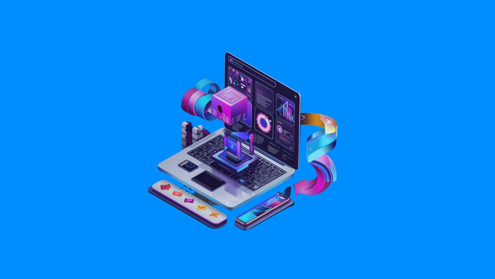
Okay, here we go. It’s time. Let’s dive into the graphic design trends for 2026.
This year promises to be a crucial one. Between AI becoming omnipresent (whether we like it or not) and a visceral need to put humanity back into our creations, we’ll have to choose sides… or learn to mix the two.
In this article, we break down the six movements shaping brands’ visual identities this year. Spoiler alert: it’s a year of contrasts.
Generative AI: it can no longer be ignored
Unfortunately (or fortunately, depending on your point of view), we have to start there. In 2026, AI will no longer be an option. We will see more and more creations assisted by Artificial Intelligence.
The end of ugly “Full AI”?
You’ve probably noticed that there are already 4×3 posters on the streets that are “fully generated” by AI. Let’s be honest: they’re often awful. They lack soul, they feel plastic, and you can spot the flaws a mile away.
But the reality is that the tool is here. And rejecting it outright would be a strategic mistake.
The future is hybrid: AI + human intuition
I think that this year, the real winning trend will be hybrid.
In concrete terms? We use AI to create a solid foundation, explore avenues in record time… and then we add human intuition on top of that. It’s this addition, this artistic “touch,” this grain, this controlled imperfection, that allows us to achieve something truly great.
At BluDeskSoft, that’s how we see it: AI is an ultra-fast production assistant, not an artistic director.
Glassmorphism: transparency at the service of premium quality
This is the second major trend we are seeing emerge across industries. Did we think it was just a passing fad in web design? Wrong. It’s here to stay.
The “Apple” effect
With its widespread introduction in iOS 26, glassmorphism has become a standard of visual quality. You know that frosted glass effect? The blurred background that hints at shapes without revealing them? That’s it.
It’s no longer just a stylistic effect, it has become a major graphic code used by tech giants.
Why adopt it for your branding?
You either love it or hate it. But it’s a reality: brands are using it more and more in their apps and websites.
Why? Because it instantly elevates your brand image. It provides a premium, technologically advanced, and in-depth look.
Beyond style, it’s a great tool for prioritizing information. Transparency allows you to create multiple reading levels without overwhelming the page with opaque blocks of color. If you want a modern, high-end look, this is something you should seriously explore this year.
Naive illustrations: the perfect counterpoint to AI
Thirdly, we are witnessing the grand return of somewhat “naive” illustrations. This is a direct reaction to the cold perfection of robots: we want to rediscover the human touch.
The Notion/Anthropic style
You know the kind? Simple lines, thick strokes, almost imperfect shapes. That’s exactly what you find in giants like Notion (which popularized the style) or, more recently, in Anthropic’s art direction.
This isn’t “child’s play.” It’s a conscious aesthetic choice that prioritizes authenticity over technical complexity.
Bringing human warmth
The goal is clear. These simple lines are used to warm up the branding. It shows that humans are behind the machine and the algorithms.
It’s a direct response to generative AI. Whereas Midjourney produces hyper-realistic but soulless images, this style of illustration creates an immediate connection with the user.
Web design: Contrasting minimalism or deliberate brutalism?
In web design, it feels like we are witnessing a duel. Two schools of thought are in direct conflict this year.
Minimalism on steroids (Dark Mode & SaaS)
On the one hand, minimalism remains popular. But be careful: not flat, boring minimalism.
We’re talking about minimalism with very strong contrasts. This is a major trend in tech and SaaS. We’ll see many perfectly executed dark modes, with neon accents that pop to guide the eye.
It’s clean, it’s effective, and it conveys an image of absolute technical mastery.
Brutalism to break the rules
On the other hand, to appeal to younger generations (or in the luxury and artistic sectors), some brands are taking the opposite approach. They are adopting the “Brutalist” style.
What is it? Broken grids, deliberate breaks in design, raw grays, huge fonts that go beyond the frame.
If you take a look at Brutalist Websites, you’ll see exactly what I mean. It’s a style that leaves no one indifferent: you either love it or hate it, but you remember it.
Typography: Bold, minimalist, and impactful
When it comes to visual identities, especially titles, I tend to see a clear evolution.
The reign of bold sans-serif fonts
No more overly thin or overly complex fonts. We’re moving towards something bolder. The use of bold sans-serif fonts is exploding in popularity.
Short, snappy messages
Many companies aim to maintain a minimalist image while adding a human touch with expressive fonts. It works well with bright colors, especially with ultra-short, ultra-impactful phrases.
Colors: The wide gap between Neon and Natural
Here again, there are no half measures. We find two radically opposed movements coexisting.
Maximum saturation (Team Dropbox)
On the one hand, we have brands that are willing to do anything. They push saturation to the max.
Neon-on-black dark modes, ultra-bright colors that sting the eyes (in a good way). Even in B2C, we see it everywhere. Look at Dropbox‘s new art direction: it’s a prime example of this desire to capture attention with raw color.
Back to the land (Health/Nature Team)
On the other hand, as is often the case, we find the exact opposite. The use of very natural tones, more “nude,” more human.
This palette is widely used in specific sectors:
- Healthcare
- Sports
- Nutrition
Here, the goal is not to shock, but to reassure and reconnect with what matters most.
In a Nutshell
2026 is a year of contrasts. Between cutting-edge technology (AI, Glassmorphism) and a return to manual drawing (naive illustrations). Between saturated neon colors and soothing nude tones.
It’s up to you to choose the codes that best serve your message and your audience.
If you want to stay on top of trends, we’re here to lend a hand. Drop us a message!